
A+ Content is the image section lower down on your Amazon page. Shoppers who scroll that far are close to buying. They have one or two questions left. Good A+ answers them.
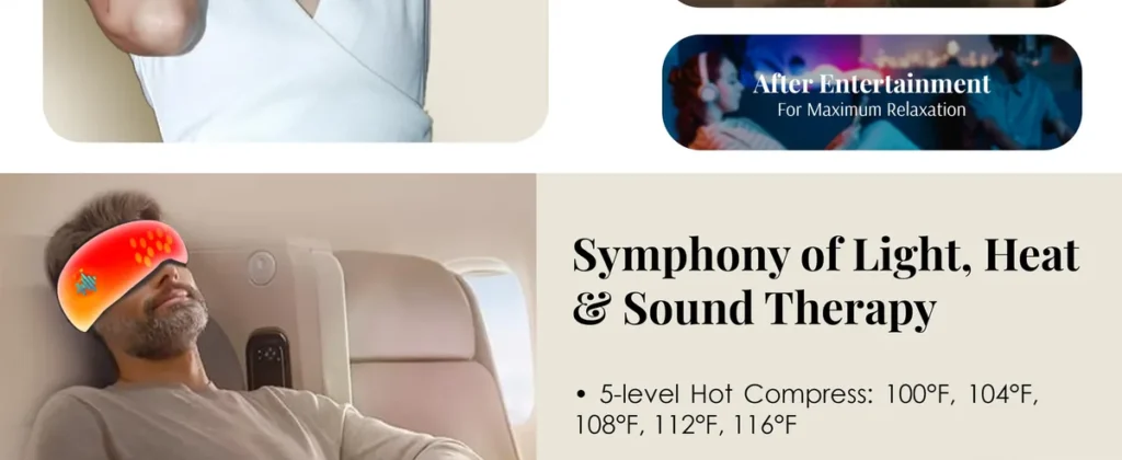
Amazon says Basic A+ Content can raise sales by up to 8%. Brands with Premium A+ get bigger modules, video and more room. Here is how we plan a Premium A+ page, using the one we made for the Hypnuse Pro AI Sleep Mask.
Start with the questions, not the modules
We read the reviews and the questions on the listing first. Then we write down what shoppers still want to know. Each module answers one of those questions.
- What does it do for me?
- How does it work?
- Where and when do I use it?
- Is it comfortable? Will it last?
- What do I get?

Make the modules flow into each other
Premium modules sit edge to edge. We design them as one long page, so colors and shapes carry from one module into the next. The shopper keeps scrolling because nothing feels like a stop.

Check every module on a phone
Most shoppers see your A+ on a phone. Premium A+ lets you upload separate mobile images, so text stays big enough to read. We design both versions and check each one on a real screen before delivery.

Keep the words short
A+ is not a brochure. One headline and a few short lines per module. If a module needs a paragraph, it needs a better picture instead.
Want us to plan your A+? See our A+ Content service or book a free call.